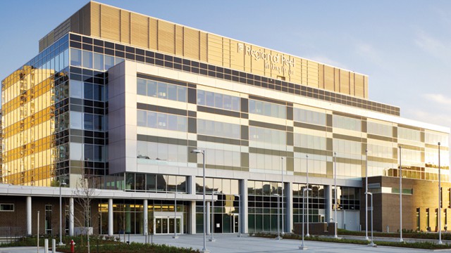
Region of Peel Spends $95,000 on Three Logo Designs
Published January 11, 2017 at 3:07 am

The Region of Peel was established in 1974, and throughout its 40 year history the structure has not changed much (and neither has its logo).
The Region of Peel was established in 1974, and throughout its 40 year history the structure has not changed much (and neither has its logo). But in this day and age of mistrust of institutions and the constant need to adapt to survive, even the stale image of Peel Region may require some kind of a facelift.
Apparently inspired by Mississauga’s recent re-branding, the Region of Peel recently commissioned a redesign of its existing logo. Suffice it to say, the reaction to the results of the re-branding was not as positive as they would have liked. The Region set aside approximately $190,000 for this project, and as of December, $95,000 was spent on producing three designs.
This is the current Region of Peel logo:

And this is what was produced after spending $95,000 for three designs:


Actually to be frank, the Number 1 design isn’t all that bad. But the ‘P’ resembles some of those ribbons worn to commemorate occasions or ‘Fight Cancer’ initiatives; I think that gives off the wrong impression. As for the other two, Number 3 looks like a cheap imitation of the Olympic rings, while Number 2 seems the most unimaginative of all because it’s just a bunch of ‘P’s strung together in a circle.
Needless to say, Peel regional councillors were split on the redesign, and they’re the ones who have to approve it. They’re not experts in graphic design or branding, which is fortunate for them, because there are local Brampton start up companies such as the Now Creative Group that took up the challenge to come up with something better. Now Creative is based in both Brampton and downtown Toronto, and these are the alternative logos they devised for Peel Region.

Now Creative, based on their own description, went with using simplicity and representing the components of the region as the theme. What I notice is the commonality of representing threes (as in Brampton, Mississauga and Caledon). The first one on the left has three colours, representing the three component municipalities. The second one in the middle shows a section of the map of Peel Region, specifically in the centre where Brampton is (which makes sense because it’s where Region’s main administrative building is located). The third one has three pillars representing the three municipalities.
In my personal opinion, I think the logos devised by Now Creative would be better suited for representing the modern day Peel Region, rather than the ones the Region is spending $190,000 for. Perhaps that money would be better spent on acquiring the services of local Brampton entrepreneurs who, on their own, have taken up this task and came up with something rather impressive.
What do you think, Brampton? Do you like the Region’s designs, Now Creative’s designs, or would you simply prefer for the Region of Peel to keep the original logo?
INsauga's Editorial Standards and Policies